The Next 25: Methodology
We know that upzoning is an incredible value unlock for Victorians. We have explored this unlock throughout our previous reports including Melbourne’s Missing Middle and Missing Middle Housing Targets.
Even the best policies have trade-offs. The purpose of this report is to tackle these trade-offs by building a robust and data-driven framework that identifies the Melbourne train stations that are best suited for this broad upzoning.
To build this framework, we measure characteristics of each station, and all land within one kilometre of that station.
To return to the main page, click here.
Data sources
This report relies on key open data sources:
-
Train patronage data, released by DataVic, which informs service frequency and patronage information for each station
-
OpenStreetMap, which informs the amenities present within each station’s catchments
-
VicPlan, which informs the prevailing zoning and heritage controls, and
Timetable and Geographic Information (bus and tram), released by DataVic as static GTFS files, which informs transport connection information for each train station
Metrics
The metrics considered when ranking stations are:
-
Service frequency: the number of trains per hour during peak travel times,
-
Line capacity: the amount of spare train capacity during peak travel times,
-
Transport connections: the frequency of nearby bus and tram services,
-
Zoning suitability: the proportion of residential land with low-density zoning, excluding heritage overlays,
-
Local amenities: the prevalence and diversity of infrastructure such as parks and schools, and
-
Distance to CBD: the distance to the CBD
Metrics were chosen based on two factors: data availability, and measurement simplicity.
The rankings are intended to capture which stations should be upzoned as a priority right now—without having to amend any legislation, reform heritage, change public transport service frequencies, or build new infrastructure.
This means that some metrics are a representation of the day they were calculated, and are likely to change over time. One notable example of an upcoming change not factored into this report is the opening of the Metro Tunnel, which will increase capacity across Melbourne’s entire train network.
For those reading in the future and interested in rerunning the numbers, the code is available on GitHub.
Service Frequency
For each given station, the number of departures on standard business days is counted across the following two periods and directions:
-
Towards Flinders Street, 7–10am
-
Away from Flinders Street, 4–7pm
The total number of services over these six hours is counted, and the per-hour average comprises the final score. For example, services an average of every 15 minutes corresponds to a score of 4 services per hour.
A limitation of only capturing peak services is that it does not capture connectivity for those without a typical 9 to 5 office commute.
On the other hand, peak hours are when most people use trains, and averaging services over the whole day may obscure important information regarding the service frequency when people use trains the most.
Line Capacity
This metric measures the amount of space available on peak train services passing through each given station. After all, there is little point upzoning around a train station if that station has no capacity to move people.
For stations in the middle of a train line, however, it is important to remember that passengers will typically continue to board the train until they reach the CBD.
For this reason, it is best to measure line capacity by observing the average number of passengers on a train at the last station before the CBD, as this is when a given train should be at its most full. This measurement gives us a better understanding of how busy the line itself is overall.
To explore this further, let’s use Victoria Park as an example.
Example calculation: Victoria Park Station
-
Identify the train line(s) that serve Victoria Park: Hurstbridge and Mernda.
-
For each line, find the station nearest to the CBD. In the case of all stations in the radial Melbourne network, all lines servicing a given station remain converged until the CBD, and so they share a single closest-to-CBD station. In the case of Victoria Park, that station is Jolimont.
-
For each pre-CBD station, calculate the average number of people on train services at that station, on each line identified in step 1.
This process enables us to derive a single score for each combination of lines serving stations across Melbourne.
Stations served exclusively by the Sunbury line (Sunshine, West Footscray, etc) typically have the busiest trains, whereas Frankston line–only stations typically have the emptiest.
Existing Transport Infrastructure
In addition to the train station itself, it is also important to measure the accessibility of other transport modes servicing the areas near the stations. In this case, we consider trams and buses.
First, we identify the list of bus stops and tram stops within one kilometre of a given train station, and pull the list of routes that service any one of those stops.
Then, for each of the routes, we access the service timetables for a typical weekday, and calculate the average number of departures per hour for each route within the one-kilometre station radius.
Because trams can typically carry twice as many passengers as a bus, tram routes are given twice the weighting of bus routes.
This weighting is then applied to each route’s average departures per hour, generating a final transport infrastructure score.
A limitation of this method is it does not—and could not reasonably—consider the direction in which the services travel, or whether the services travel to useful places.
Zoning suitability
This measure intends to capture the suitability of existing zoning surrounding train stations. An ideal station would have many low-density residential lots that are able to be redeveloped under current planning paradigms.
Therefore, a ‘suitable lot’ is defined as one within a kilometre of a given train station that is currently:
-
zoned either Neighbourhood Residential, General Residential or Residential Growth, and
-
not affected by any heritage controls.
The final zoning suitability score is the eligible land area in square metres, as a proportion of the total area.
Train stations that score poorly in this metric are likely to be zoned for commercial or other non-residential purposes, or subject to an extreme regime of heritage controls.
Stations that score highly have large areas of low-density, mostly detached housing.
Local Amenities
Train stations best-primed for upzoning have a diversity of local amenities ready to be shared by the new residents that more density enables.
For this model, we choose a small subset of amenities. These are: school, childcare, park, supermarket, restaurant, cafe, bar.
The choice of the amenities is arbitrary, and intended to measure necessities and amenities that make for highly walkable neighbourhoods. For the amenities chosen, OpenStreetMap contains reasonably accurate data. Data on more niche amenities may be limited by poor data.
To derive a final score, one could simply sum all the amenities. However, this would result in no difference between a station surrounded by 50 cafes and no parks, and one surrounded by 50 parks and no cafes. Other methods, such as median number of amenities or mean number suffer from similar problems.
To combine these amenity counts into a single value, an xmin-xmax transformation is used. Each column is transformed through the following function:
\[ x = \frac{x - \min{x} }{ \max{x} - \min{x} } \]
The result of this transformation is a set of single values for each amenity per station, represented as a percentage of the range (max – min) of all stations in the sample, bounded between zero and one. A zero corresponds to the lowest value out of all stations, and a one corresponds to the highest value.
The transformed values for each amenity are then summed, forming a single per-station metric for the number and diversity of key amenities nearby.
No weighting is applied for this sum. Each amenity type is treated equally as important as each other. It would be trivial to change the amenity weights in the code and re-run if desired.
The scoring method takes into account the fact that raw numbers mean different things for different amenities, which a simple summation or mean would not consider. For example, having 10 cafes in an area is less important than having 10 schools, although without additional manual weighting, a mean or sum would be unable to distinguish the two.
The final value may be less easy to immediately interpret, but in return it offers a more meaningful distinction between stations as they are ranked within the model.
Distance to CBD
Stations closer to the CBD are likely to have higher land prices, making upzoning more feasible, more effective, and more important.
Distance is measured ‘as the crow flies’ from Flinders Street Station to each given station, in metres.
Calculated values
The searchable table below contains the raw values calculated for each station.
Transformation Process
The model’s final step is to transform the results of all metrics for each station into values that can be summed into a single comparable score.
We use the same xmin-xmax transformation used to generate the Local Amenities scores above to scale each metric to a value between 0 and 1.
\[ x = \frac{x - \min{x} }{ \max{x} - \min{x} } \]
One downside of the xmin-xmax scaler is its high sensitivity to outliers. A few very high or very low values within a given metric can flatten the remainder of the data and render the entire dataset less useful.
This is why this report considers Melbourne’s three Edge Stations (Richmond, South Yarra, and North Melbourne) separately from the rest of the networks. Their inclusion would distort the entire model due to their outlier service frequency values.
Inverted metrics
For two of the metrics considered—line capacity and distance to CBD—higher values imply less suitability for upzoning, rather than more.
To account for this, these metrics are inverted (x=1−x), ensuring that higher scores reflect greater upzoning suitability.
Variable Weighting
Because Activity Centres are a housing policy first and foremost, within the report we have set the default weighting to favour proximity to the city and the potential for new housing around the station. As such, these variables are weighted as twice as important as the remaining variables.
These transformed scores are then summed to produce a final score.
We provide a page where readers have the opportunity to decide which metrics are most important to them, and see which stations should be upzoned as a result.
See our interactive rankings tool here.
Transformed Scores
Distributions
The chart below shows the distribution of metrics after they have been transformed and weighted according to their importance.
This is reflected in the fact that most variables are bound within 0 and 1, however more important variables range from 0 and 2.
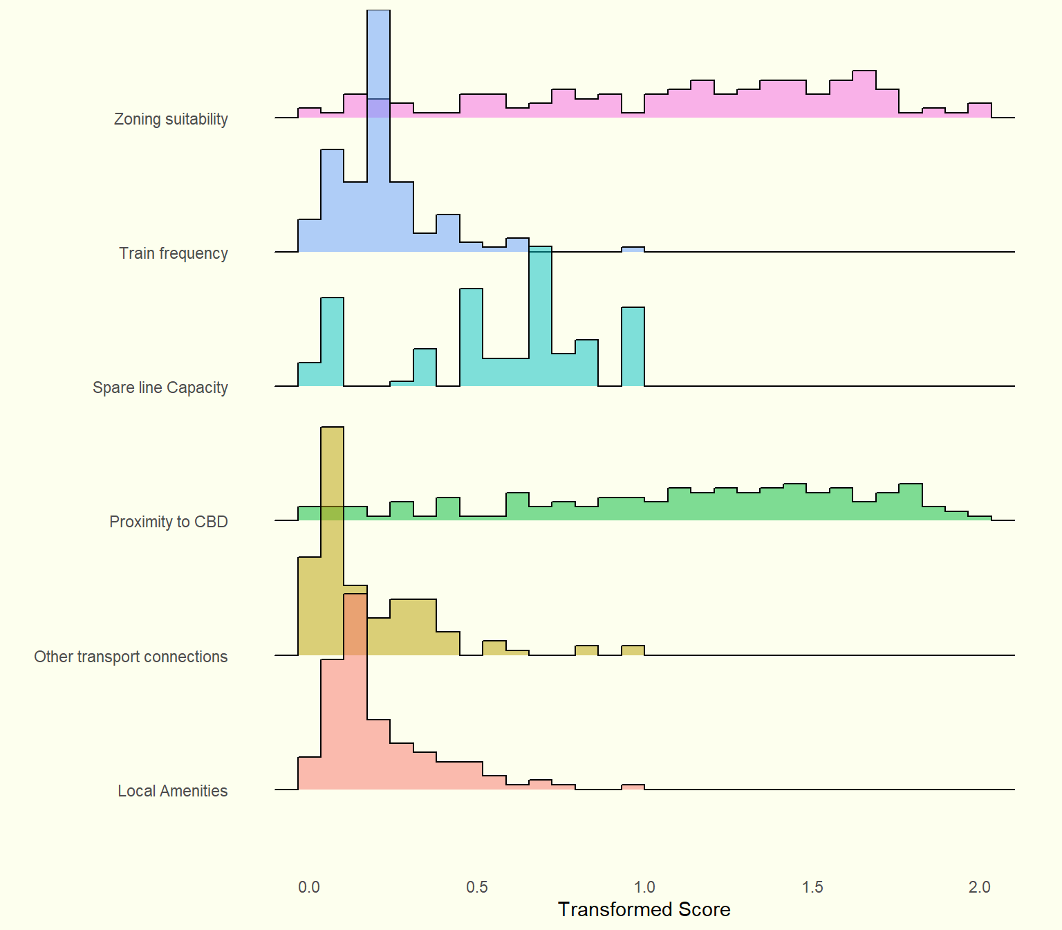
Created with ggridgeline.
The table below shows the final transformed scores for each station.
The table can be searched and ordered by the user.
Additional Analysis
The graph below shows the distribution of the metrics before they are transformed.
Raw scores

Train frequency has fewer unique values and a high peak at approximately 6 services per hour, giving it a unique shape compared to other variables.
Best and Worst Stations
The table below displays the stations that are the best and the worst for each metric used in the ranking process.
Additional Information on Amenities
Since the ‘Local Amenities’ measure is a composite measure itself, it is also possible to look at the best and worst stations for each amenity type.
Collingwood leads the pack and is top of the class in bars, cafes, restaurants and supermarkets.
For lowest values, there is more variance, with only Glen Iris being the lowest for two amenity types: bars and supermarkets.
To return to the main page, click here.